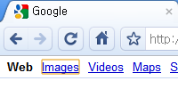
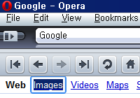
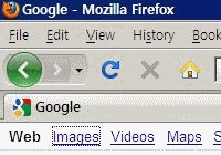
When you tab through a web page with your keyboard, a visual focus will move through all the links and form controls in the page. Modern browsers such as Opera, Safari, and Google Chrome and most of mobile browsers provide a visually distinctive focus. This clear focus dramatically enhances usability and accessibility of keyboard users (eg. people of visually impaired or low vision) as well as general convenience for majority of users. However two widely used browsers, Internet Explorer and Firefox stick to the traditional, not very conspicuous visual focus of gray dotted outline. This faint outline focus often makes me get lost when I use my keyboard for the within-page navigation. Compare the following default visual focus of each browser (for Windows):
| Apple Safari | Google Chrome | Opera |
|---|---|---|
 |
 |
 |
| Firefox | Internet Explorer 8 |
|---|---|
 |
 |
To get a clearer visual cue of where I am in a web page, I set the following user style sheet for Firefox and Internet Explorer.
:active, :focus {
	outline-width: 2px !important;
	/* outline (unlike border) property does not take the space */
	outline-style: solid !important;
	-moz-outline-radius: 4px;
	/* this affects Firefox only, it makes the outline rounded  */
}
Refer to the articles below to get information about how to set your user style sheet in the two browsers:
- How to write a user style sheet for Firefox (Modify userContent.css.)
- Where is my Mozilla profile located? (Find where the userContent.css is located.)
- Write a user style sheet for Internet Explorer for Windows
Once you configured your user style sheet successfully, all the objects (including text links, image links, radio buttons, text input fields, image type buttons, etc) will be clearly outlined and stand out! Now enjoy your keyboard navigation and never get lost within a page!
| Firefox | Internet Explorer 8 |
|---|---|
 |
 |
Be careful that the Internet Explorer version 6 and 7 do not support CSS outline property.